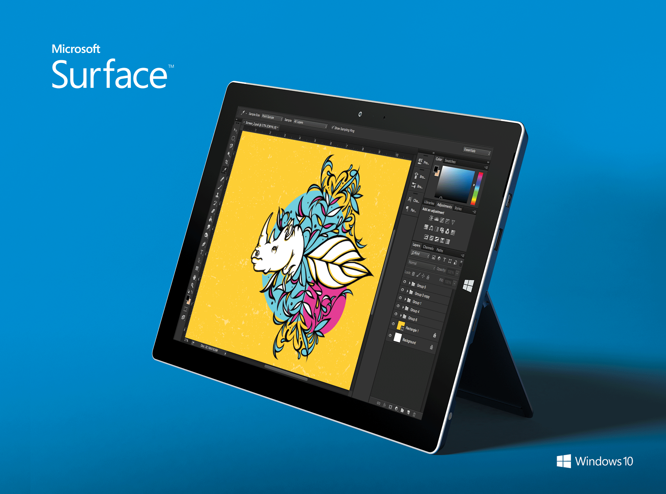
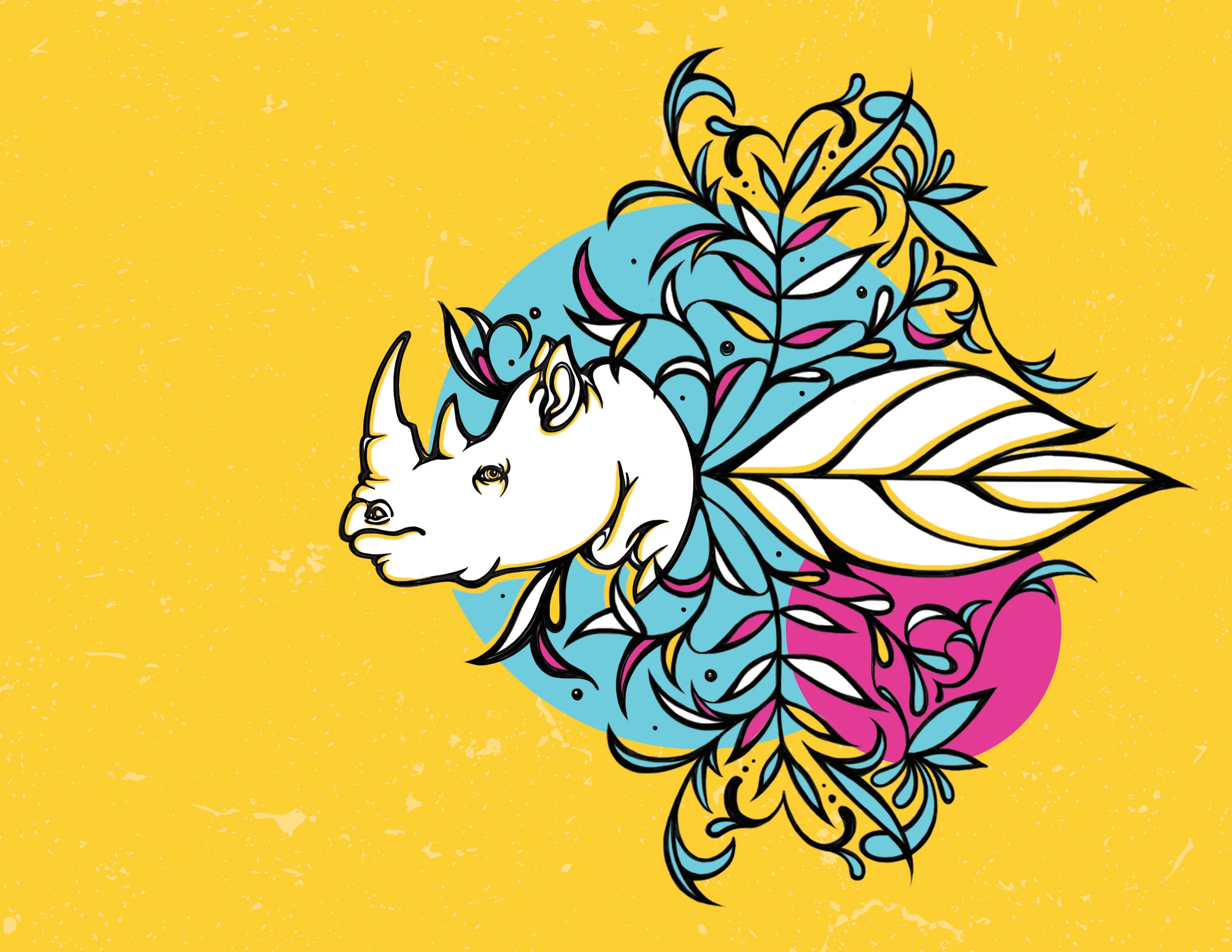
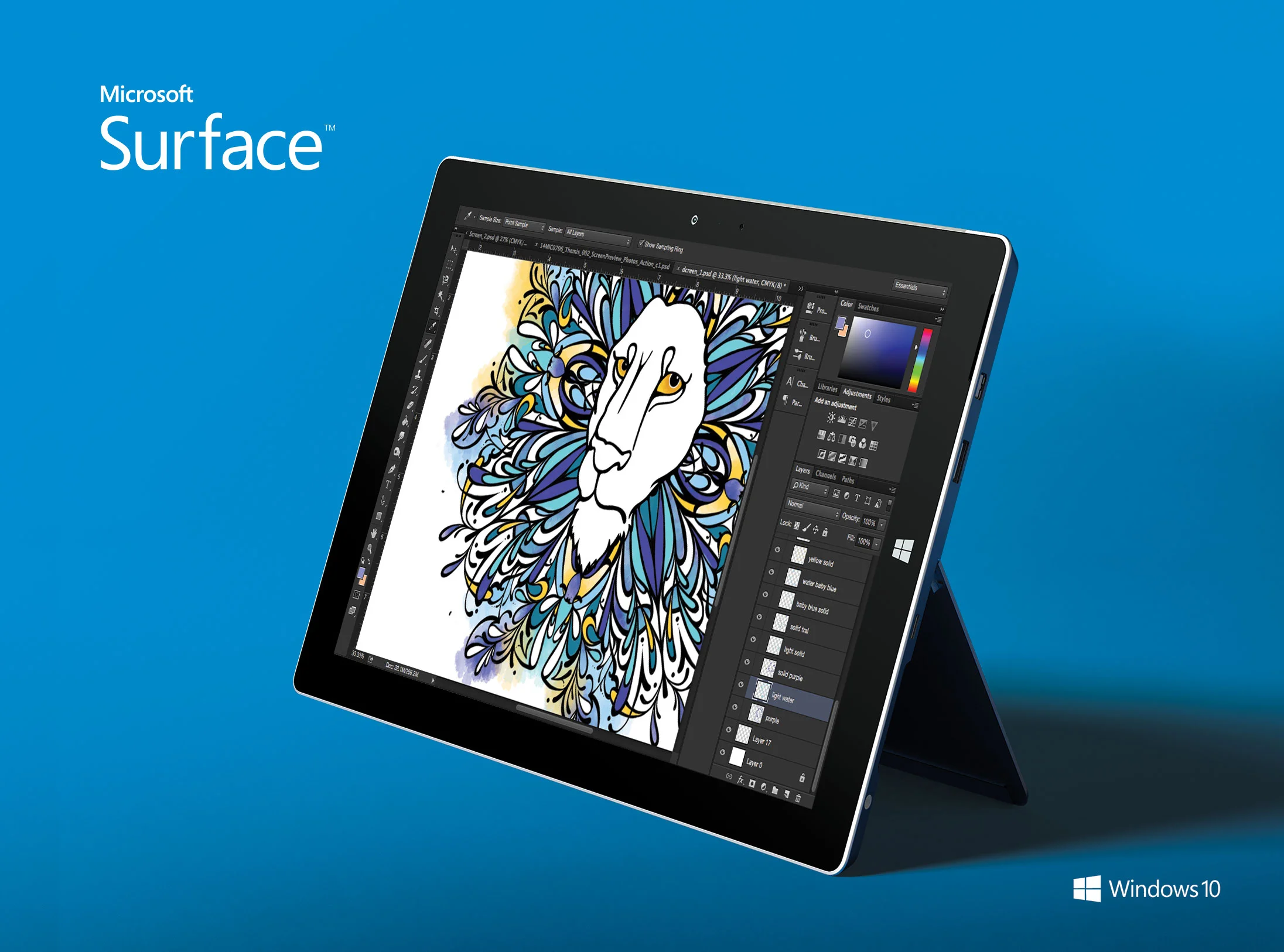
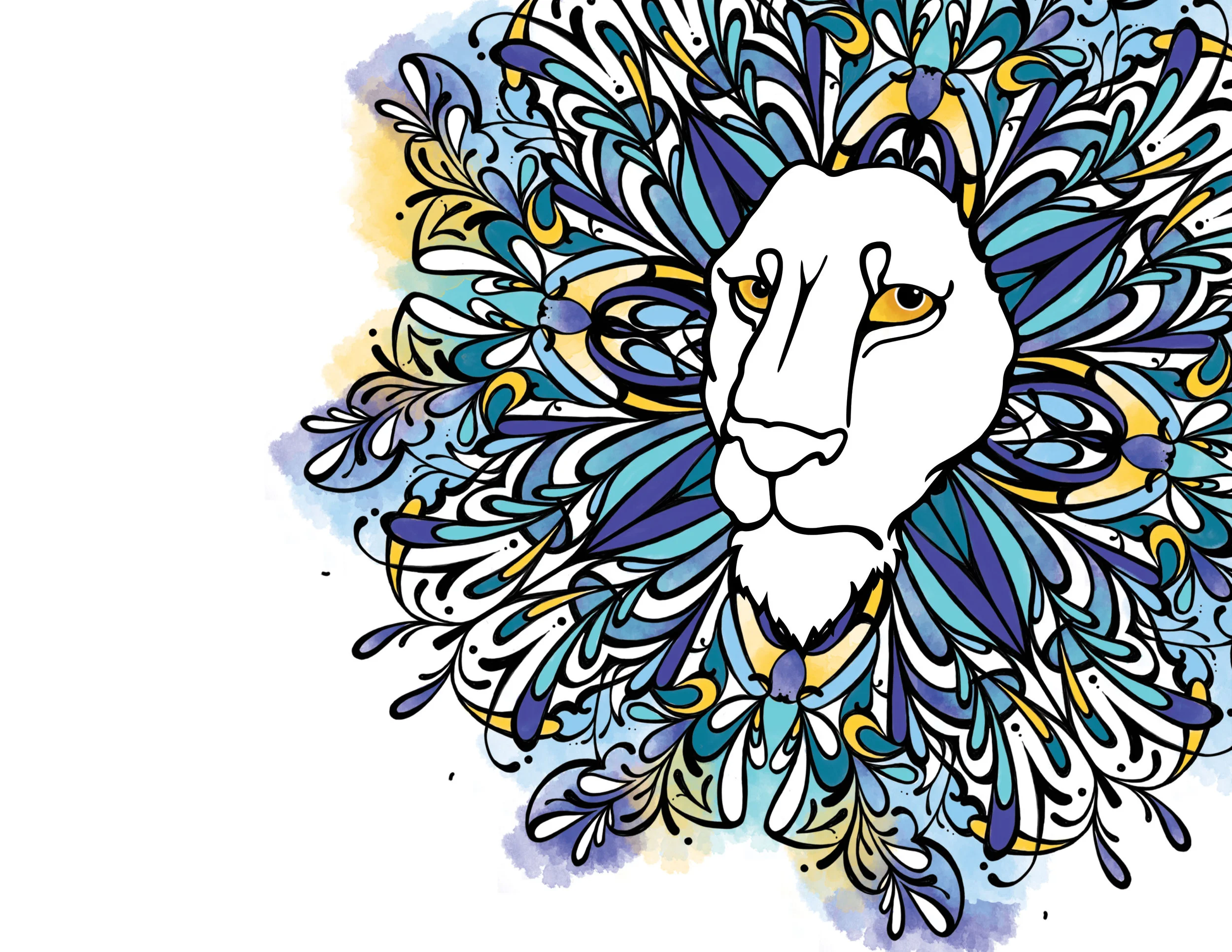
I had the opportunity to use my illustration skills for the concept mockups for the Microsoft Surface screens. The advertisement goal was to show how the Surface is capable of handling software such as Adobe and detailed enough to become artist's creative platform. Although these were not picked, I was excited to merge my design and illustration skills.
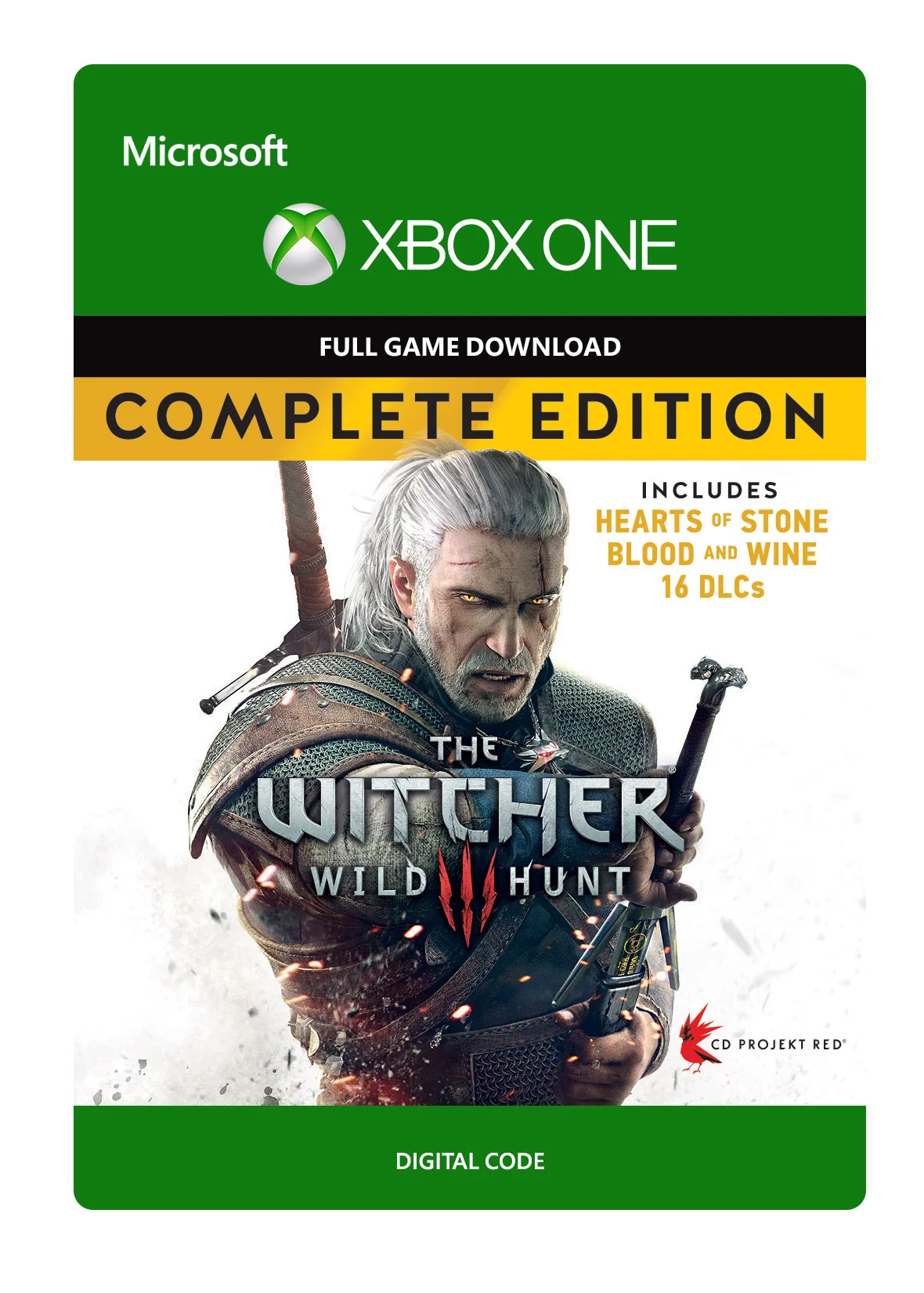
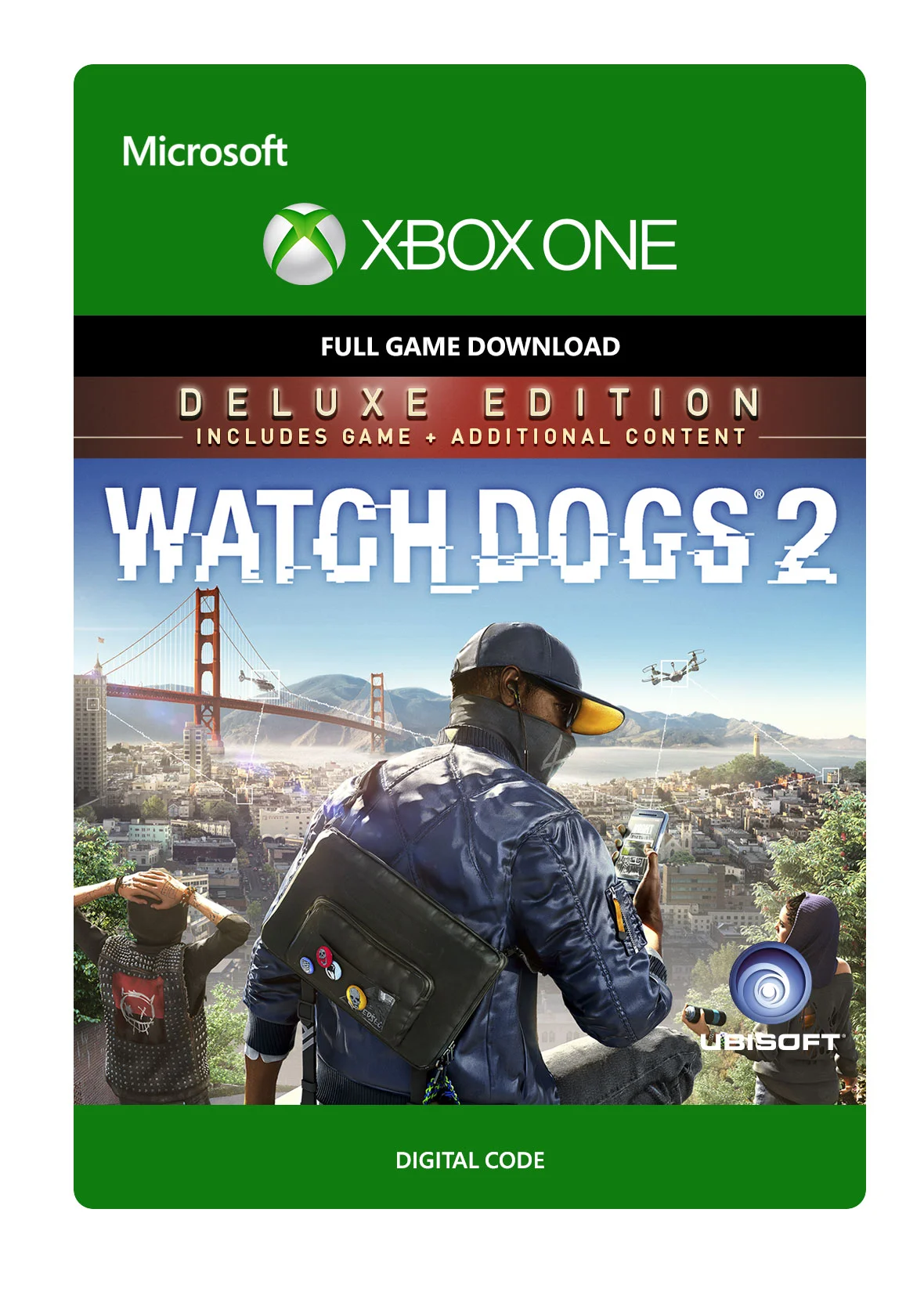
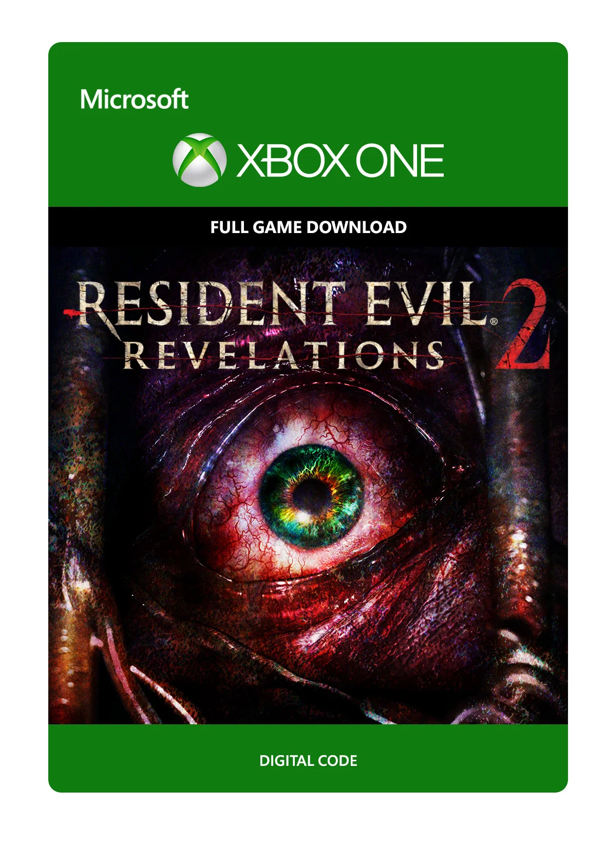
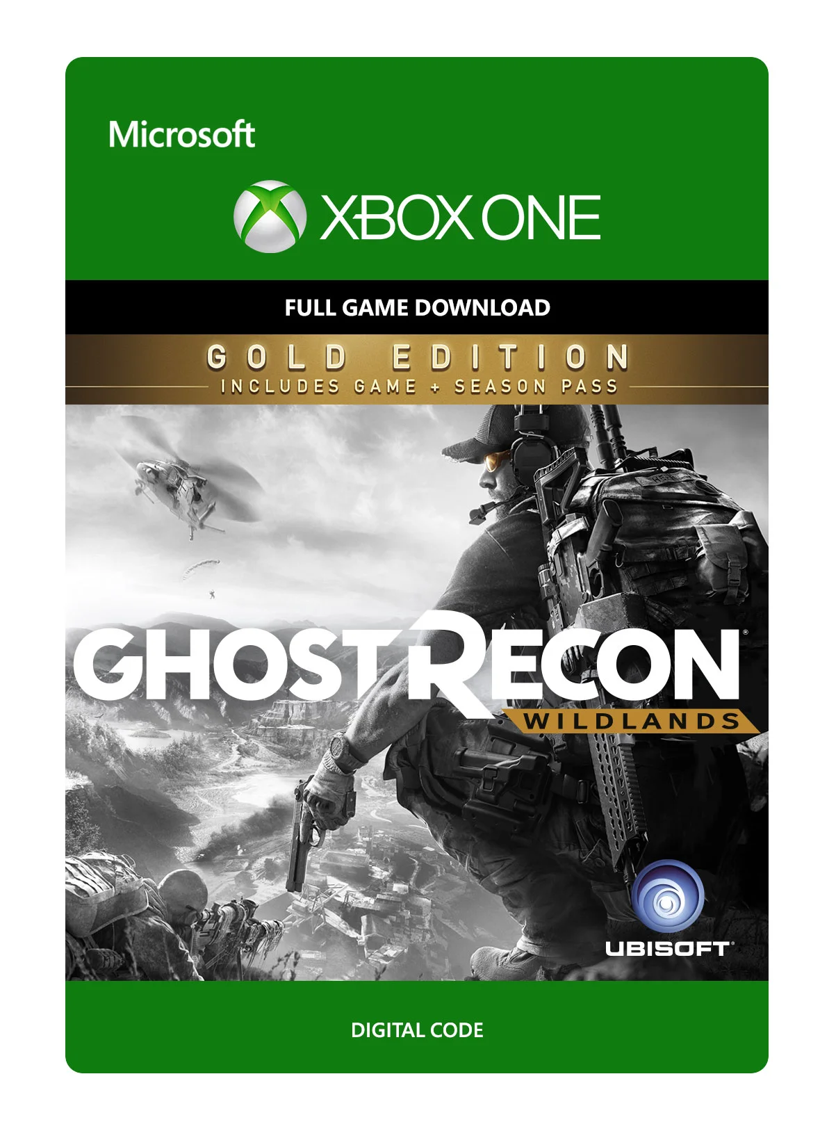
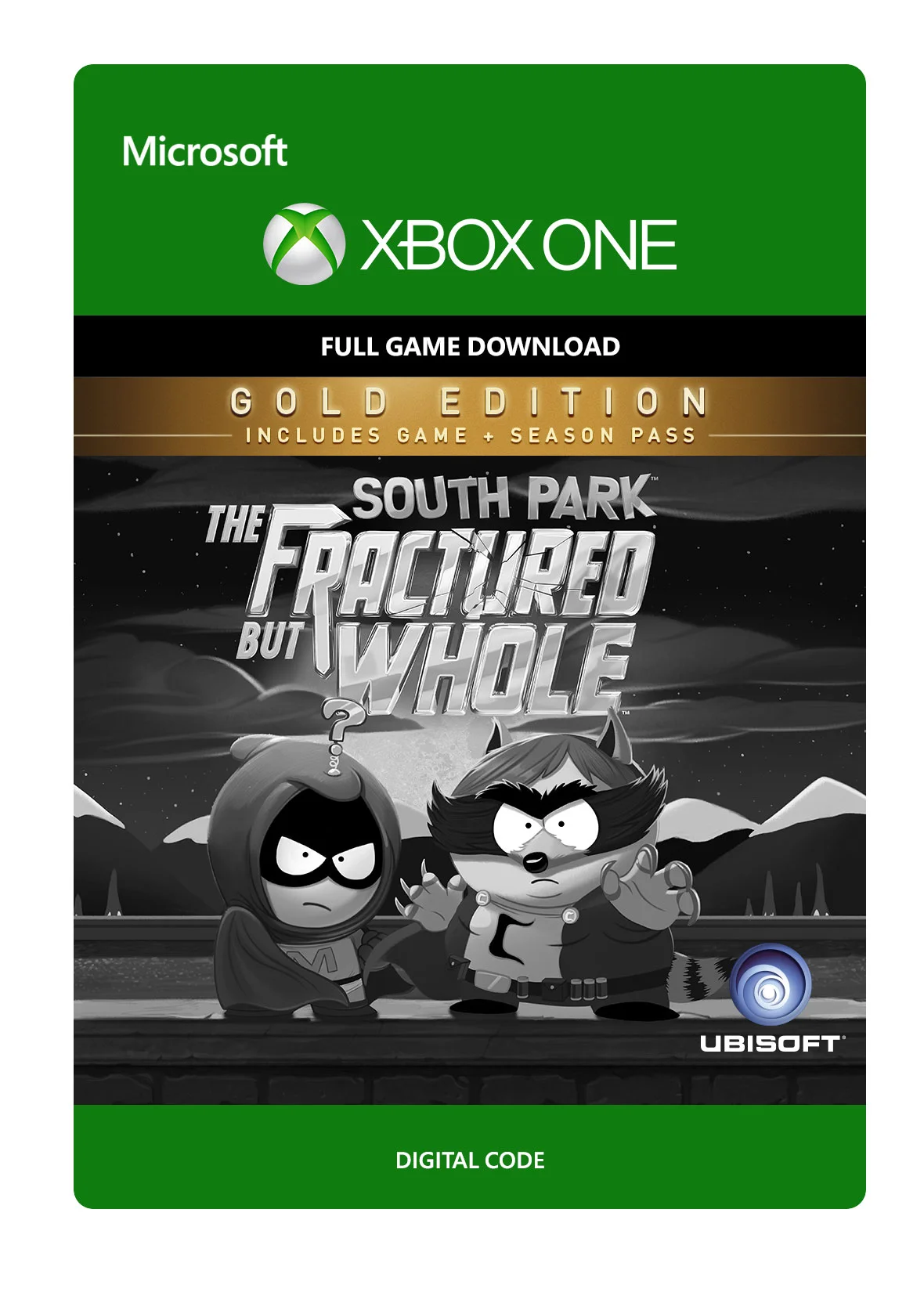
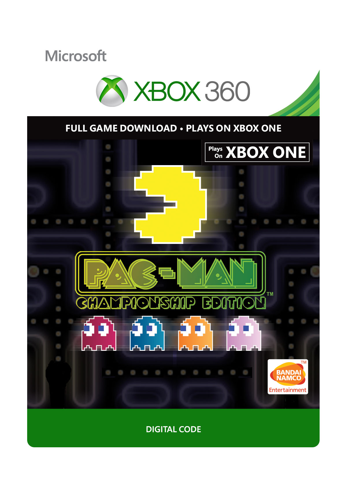
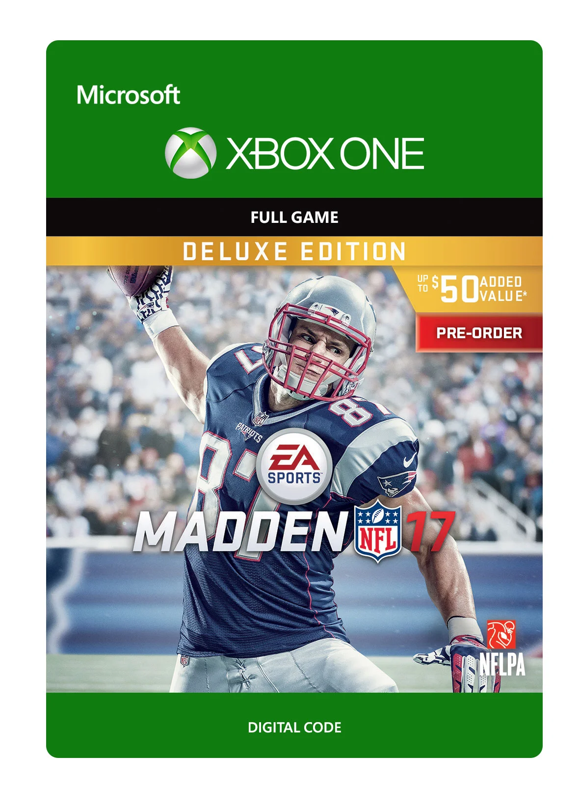
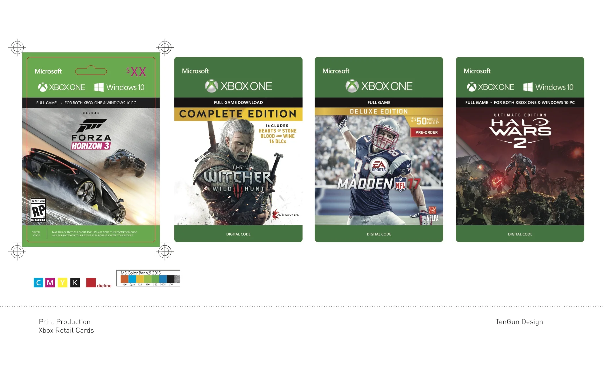
These retail game cards were a mixture of digital designing and print fabrication. The assets were taken into Photoshop to create the artwork for the digital online and then forwarded to InDesign to create the printable layouts with consciousness for multiple language translations and eco level of the color intake.
Xbox Retail Cards
Print production- Adobe Photoshop, inDesign
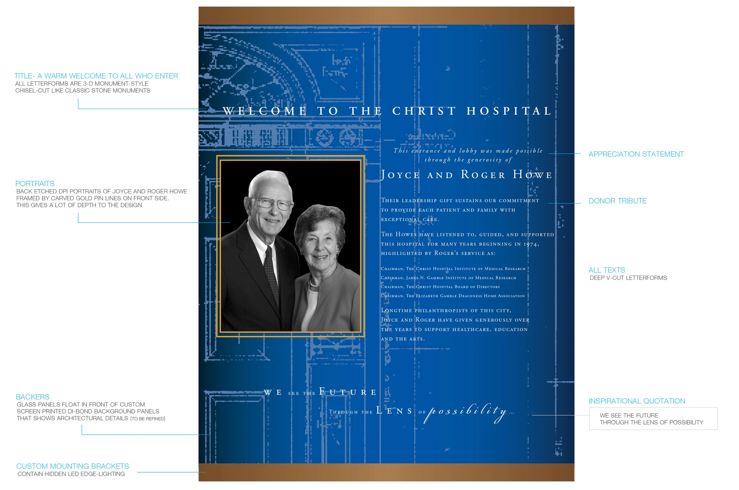
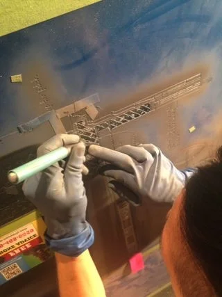
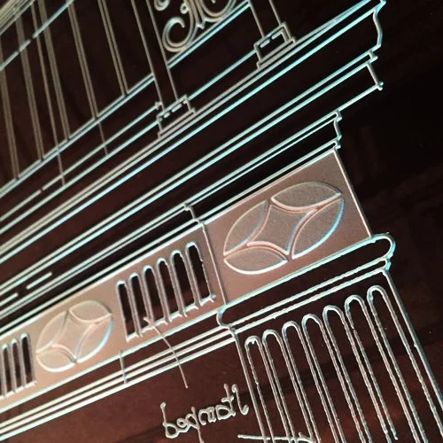
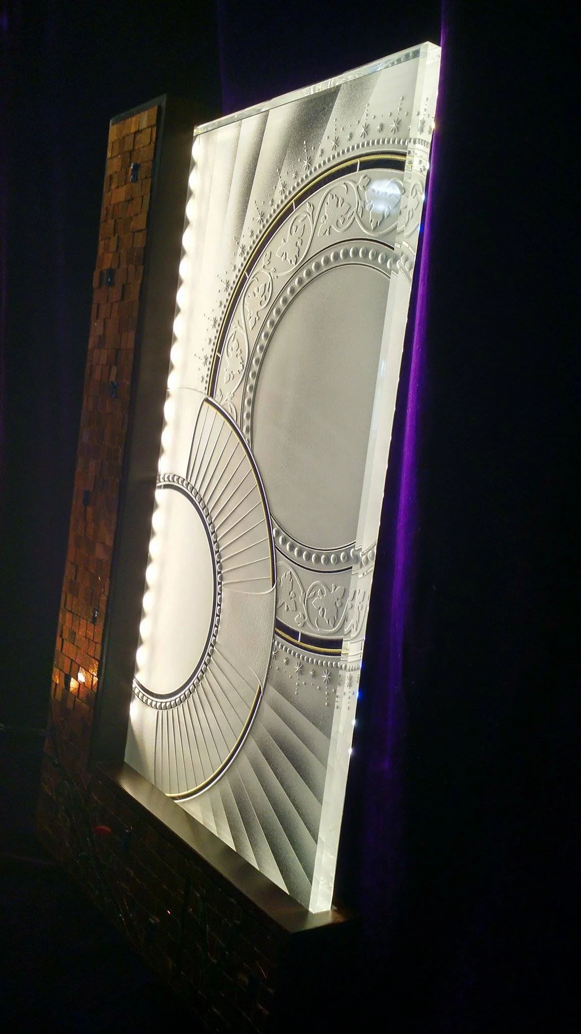
I had the honor of being part of the small crystal glass studio located in Portland, OR. I was able to work and design some plaques, murals, digital displays, and sculptural works of art for hospitals, universities, corporations, and museums. These are all hand sand-blasted to achieve this carved monumental style outcome. Although I can't share the final project photos, please enjoy the concepts and process pictures.
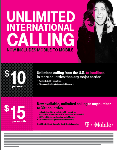
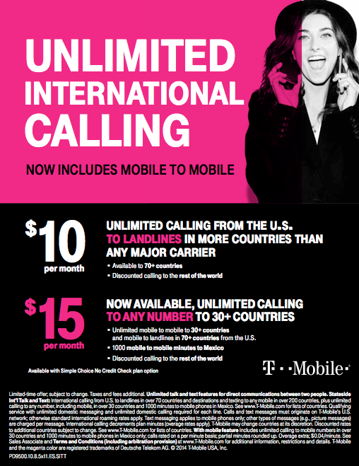
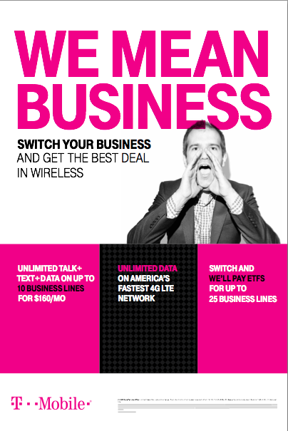
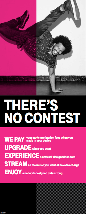
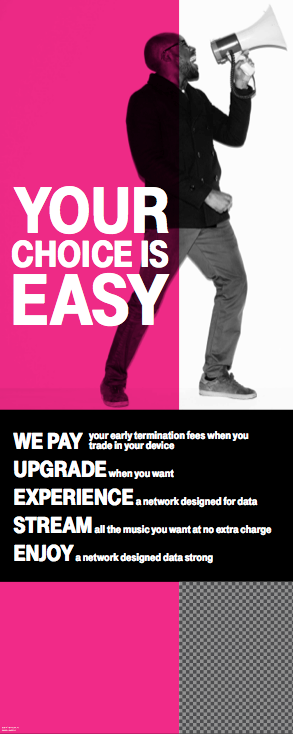
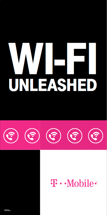
I had the privilege to work on T-mobile ads while being with WONGDOODY. From store front window to simple in-store ads, I learned the T-Mobile brand guidelines throughout the proccess of creating.
These two table tents, in particular, were a bit of a challenge because the client wanted to be flexible on how these could be displayed. In the end, we came up with reversible table tent that employees can simply flip when the season passes. Easy to manufacture, affordable, and does its job.
Animal Care expo campaign.
Problem: Most animal expos are geared towards a higher age group
Solution: Use high quality pictures, sensitive type treatment, and eye catching colors to attract younger crowd
t-shirt design
front and back
available in black, white, and grey
t-shirt for pets
Banner
Bag for the expo
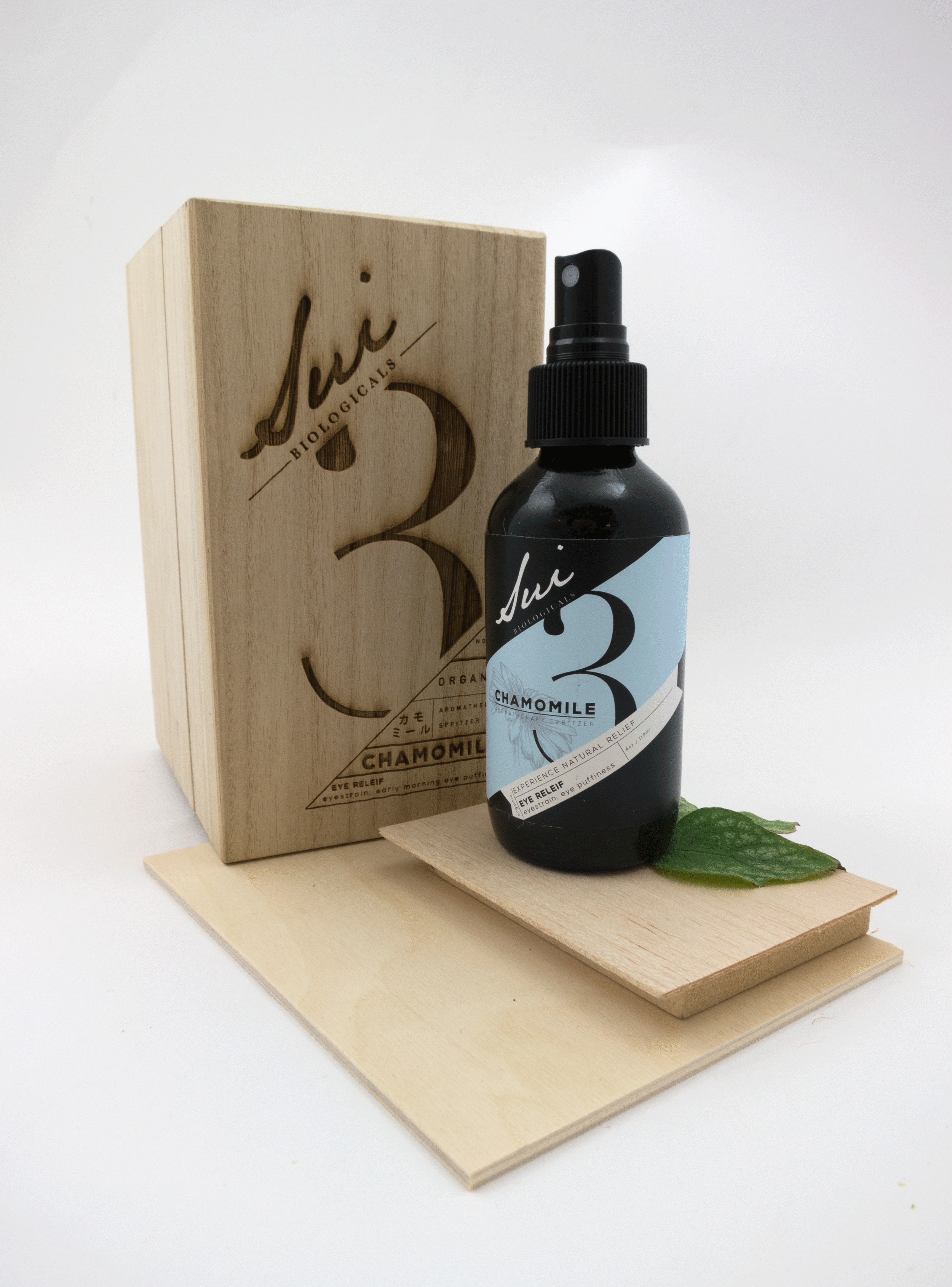
student project: Packaging design
Objective: Make packaging for anything of your choice
Object: Aromatherapy bottle
Problem: too feminine
Solution: Tone down feminine-esque type, and graphics.
I noticed that many aromatherapy products are geared towards females. This is why I wanted to make a unisex design that both genders will be comfortable using.
1st attempt:
Too angular and focused on color. Not relaxing looking like aromatherapy should be
2nd attempt
Too busy with the type, and the type face for the number is not working
attempt 3
Changed font and color
Still very busy: must simplify
Final design: much cleaner look
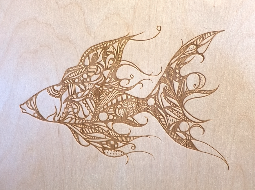
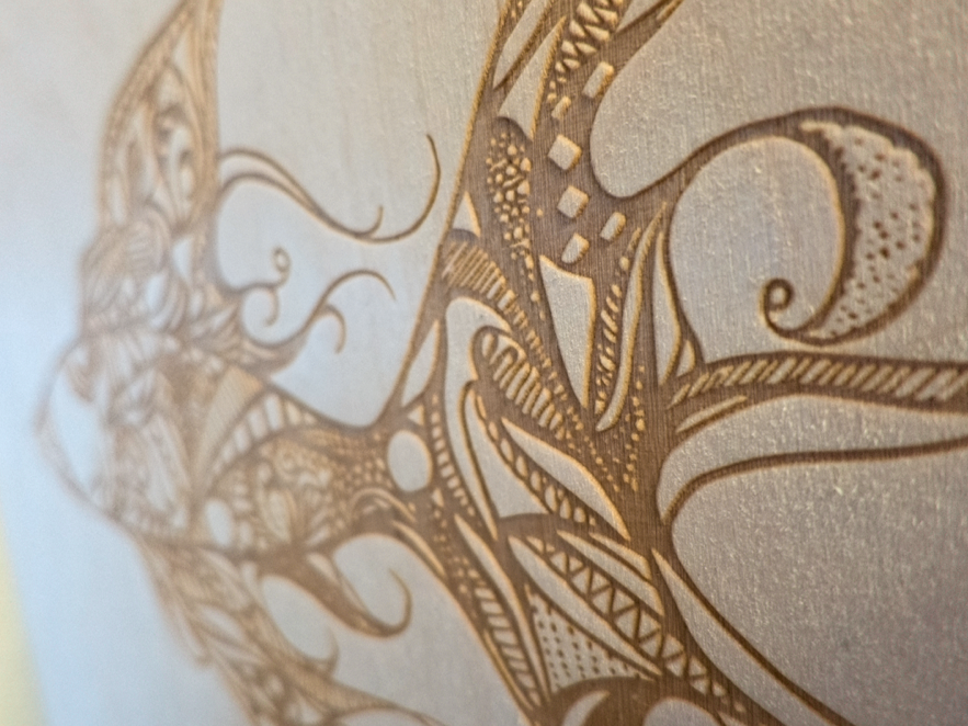
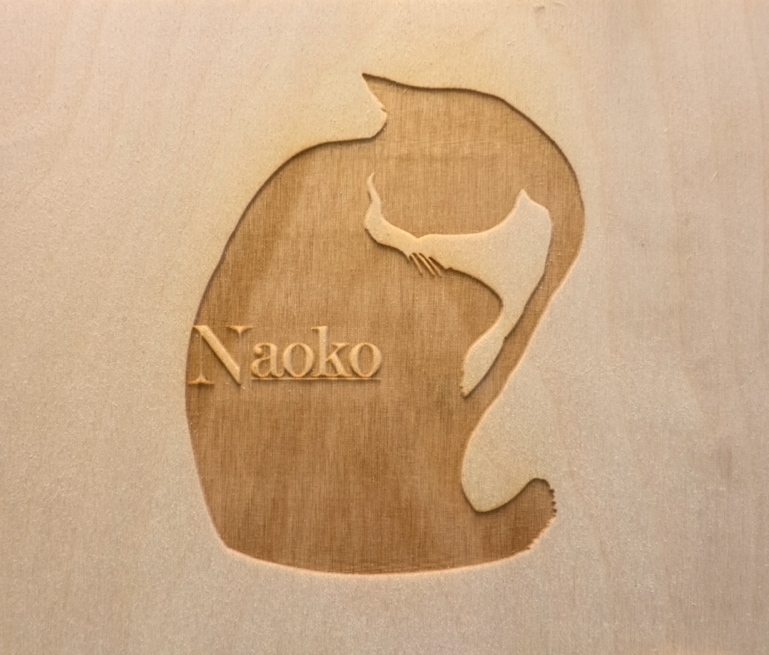
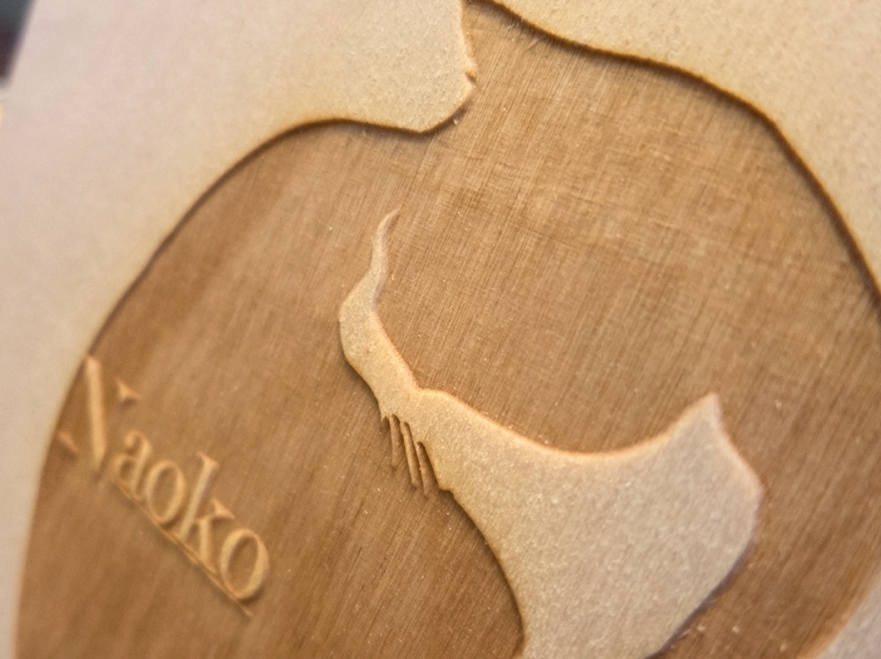
Laser cut wooden box.
Wood because in many cultures, things in wooden boxed shows natural beauty, elegance and importance.
Inside:
Burlap is wrapped around eye mask for people who might want to use this while sleeping.
Direction is matching the bottle to unify objects.
Bottle is gently resting on thin piece of wood to show gentleness.
Goal: create point of purchase that goes with the packaged object
wooden display to unify the original box.
In layer to use space efficiently.
Planks showing numbers to intrigue audience from far way.
Bottom to top: concentrated scent tester, labels, bottles, and planks
The bottle is on the highest part because oftentimes the tester bottles which are pricey to replace, children tends to play with it. By placing it higher, it is out of reach.
I had the opportunity to work with the laser cutting machine. From simple to complicated, from balsa wood to pine.